 Figma
 API
 Web to code extension
 Adobe XD
 Discord
 Twitter
 GitHub


 Blog

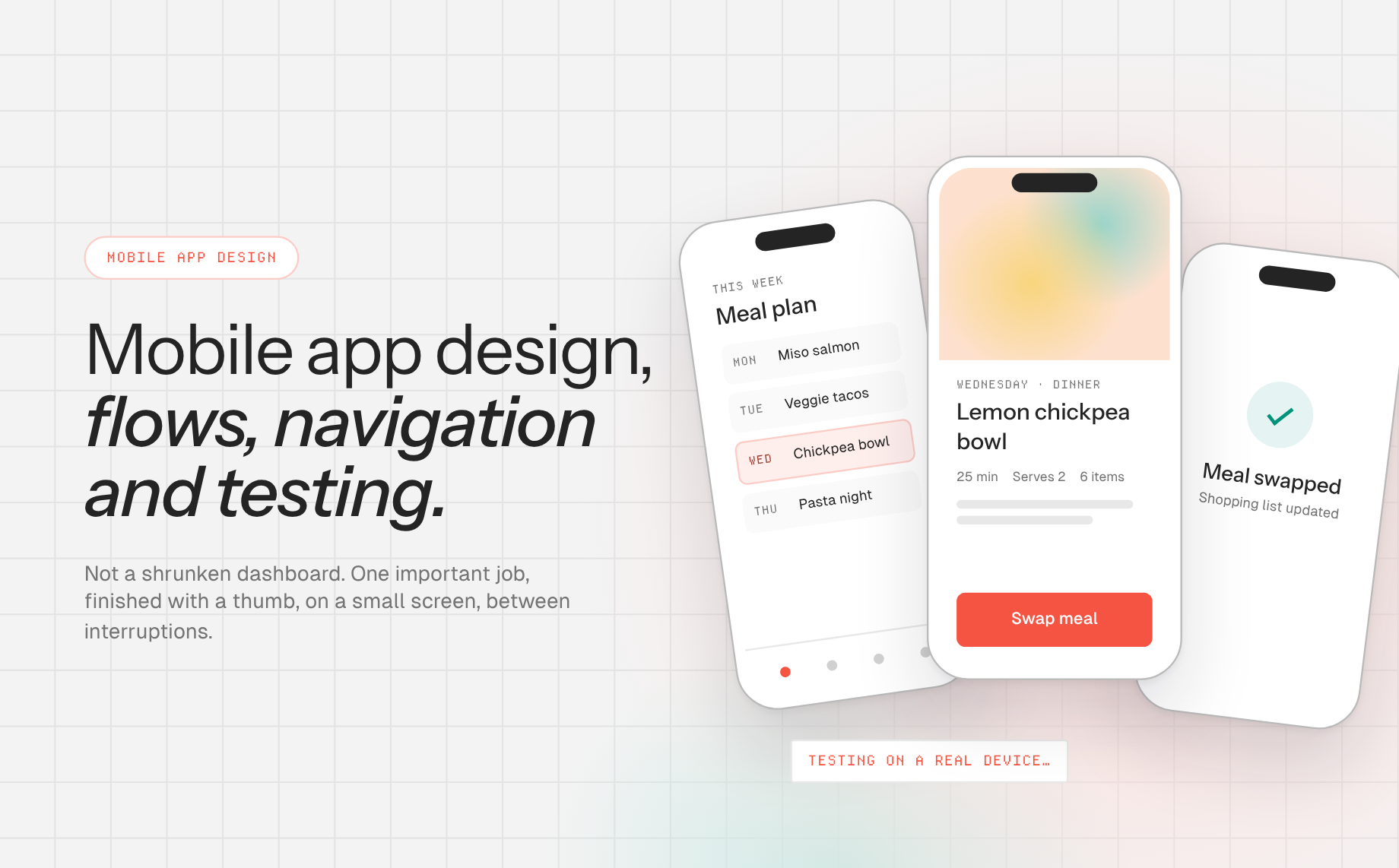
Mobile App Design: A Practical Guide to Flows, Navigation, and Testing8 min read
Reading Time: 6 minutesMobile app design is the process of shaping an app’s tasks, navigation, content, and interaction for small screens and touch-first use. The goal is not to shrink a desktop dashboard. It is to help someone finish an important job while space, attention, connectivity, and input are constrained.
A useful mobile design starts with the task and the target platform. For the broader distinction between task outcomes and screen-level decisions, see our user experience basics guide. A native iOS or Android app must respect platform conventions and device capabilities. A mobile web app or responsive prototype can test the same journey, but it does not automatically become an App Store or Play Store binary.
Anima Playground is useful when you need to explore a mobile-oriented flow as an interactive, responsive web prototype, especially from a prompt or Figma screens.
Prototype a mobile flow in Anima Playground, then validate the design against the platform and user checks below.
What makes mobile app design different?
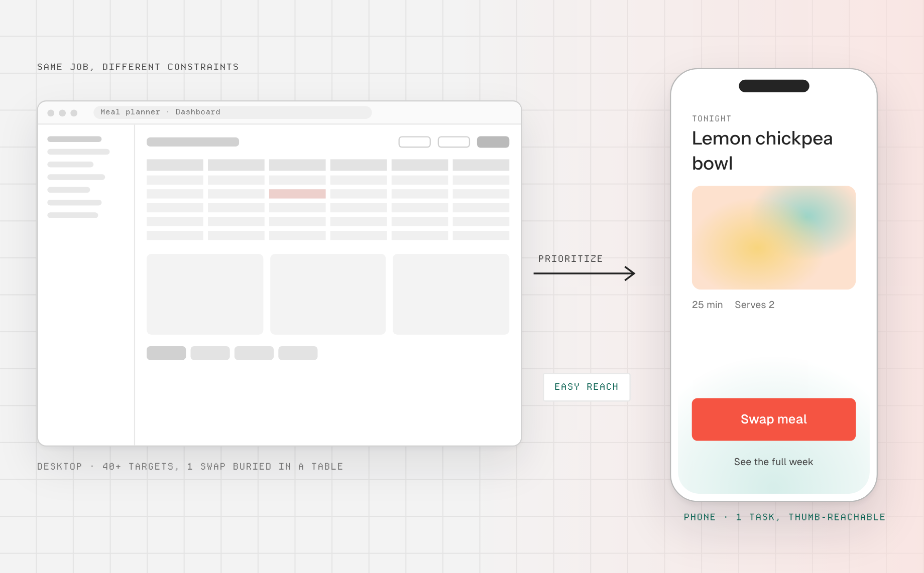
On a phone, a hand covers part of the screen, an on-screen keyboard changes the available space, and interruptions can break a task. Successful mobile app design makes the most important content legible at a glance, keeps actions reachable, and lets people resume or recover. It also considers orientation, text scaling, dark mode, accessibility settings, and where a screen sits in the wider journey.
Apple’s interface fundamentals note that iOS and iPadOS layouts need to adjust across device sizes and orientations. Android’s adaptive layout guidance likewise treats phones, foldables, and tablets as a range of contexts rather than a single fixed canvas. Those are design constraints, not an instruction to make every platform look identical.
Plan the app around one core journey
Suppose you are designing a medication reminder. The primary job might be “Confirm the scheduled dose or snooze safely.” Map entry points such as a notification or home screen, the decision, confirmation, and recovery if a reminder was tapped by mistake. A journey map clarifies why a screen exists; a user flow makes the screen-to-screen decisions explicit. For health or safety-critical tasks, domain experts and real-world validation are essential, and a prototype is not clinical advice.
For a lower-stakes example, use a meal-planning app: browse this week’s plan, open a recipe, swap a meal, and confirm the change. Draw the happy path and then the realistic interruptions: no saved meals, slow network, an unavailable recipe, a very long ingredient name, and a user returning mid-task. Design those states before adding visual polish.
Mobile app design principles that survive the handoff
Prioritize content before choosing navigation
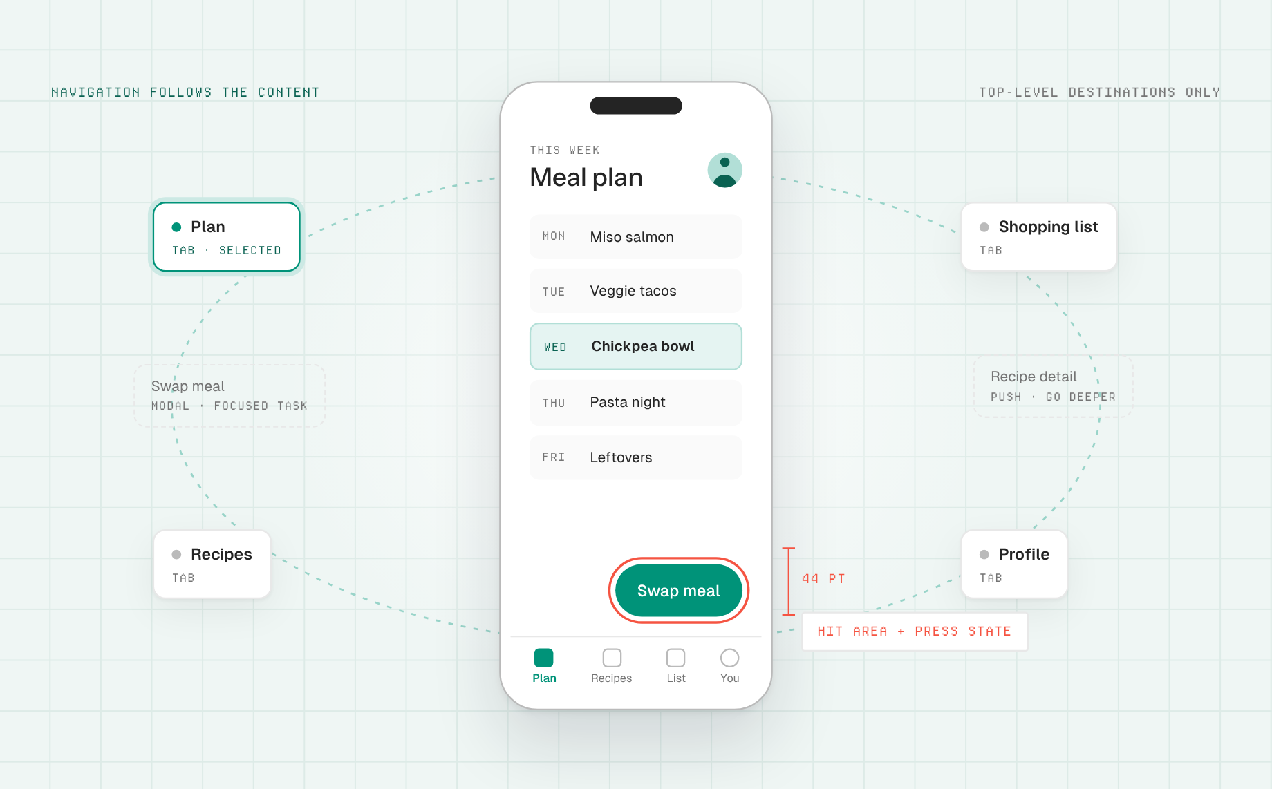
Identify the few top-level destinations people return to regularly, then choose a navigation structure that represents that information hierarchy. Apple explains in its iOS navigation design session that tab bars are for top-level areas, hierarchical transitions for moving deeper, and modal presentations for focused context shifts. Do not put every feature in a tab just to make it visible. For complex menus, Smashing Magazine’s mobile navigation pattern review explores alternatives to defaulting to hidden nested menus.
Give touch targets room and show a response
Separate adjacent actions so a finger can reliably select the intended one. Apple’s button guidance recommends a hit region of at least 44 by 44 points and a press state for custom buttons. That is an Apple platform guideline in points, not a universal CSS-pixel requirement. For mobile web, consult WCAG 2.2 for its distinct pointer-target criteria and exceptions. Show immediate feedback when a tap is registered, and make longer operations visibly progress.
Make text and forms resilient
Use short, literal labels, persistent field labels, and errors beside the affected field. Ask for the minimum input needed for the current task. Check how the keyboard changes the layout and whether the primary action remains reachable. Test with longer translations and larger text settings; a design that only works with placeholder copy is unfinished.
Design all states, not just the onboarding screenshot
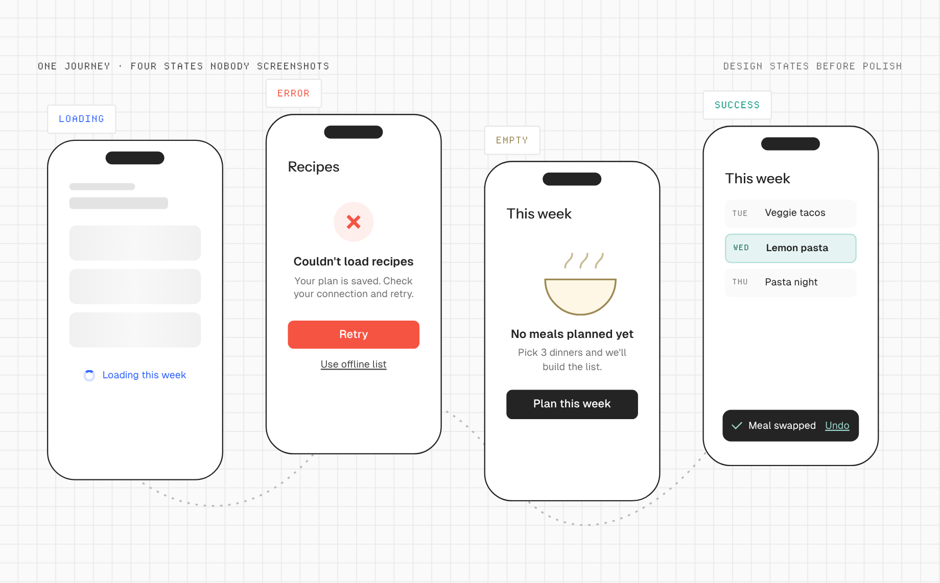
Include loading, empty, offline, permission-denied, validation, saved, and failed states where relevant. Explain the consequence of a permission request before asking for it. If an action fails, preserve the user’s work and offer a specific recovery. Nielsen Norman Group’s usability heuristics provide a solid review framework for feedback, consistency, and error recovery.
Keep a shared visual language without erasing platform context
Specify type, color, spacing, iconography, and component states as reusable decisions. Material Design’s foundations describe tokens and interaction states as part of a coherent UI system. Preserve your brand while allowing navigation, controls, and accessibility behavior to feel appropriate to each target platform. A responsive web prototype helps test the concept, but native teams still need to implement and verify platform-specific behavior.
A practical mobile app design workflow
- Choose one user and one critical task. Write the context in which they open the app and what counts as a successful outcome. Do not start by drawing a home screen.
- Map the minimum flow. List the entry point, screens, decisions, exits, and recovery paths. Remove a screen if it adds no meaningful choice or information.
- Sketch mobile-first layouts. Use actual content and realistic device sizes. Prioritize one primary action per view, but leave secondary actions discoverable.
- Define navigation and components. Decide which destinations are top-level and which belong in a detail flow. Record touch, focus, disabled, loading, and error states. If you have a library, use a Figma design system as the shared starting point.
- Build a responsive web prototype. In Anima Playground, prompt for the flow or import Figma frames. Anima’s Import from Figma guidance describes adding mobile and tablet versions to a responsive project. Preview screens and navigation in a browser at relevant widths. Do not label this output a compiled native app.
- Test on actual devices and with users. Watch someone complete the task with touch input, keyboard and screen-reader support where applicable, varied text sizes, and a slow or interrupted connection. Log observations, revise the interaction, and retest.
- Hand off platform requirements. Give engineers the flow, state inventory, component rules, responsive prototype, and native-specific behavior to implement. Verify the eventual native implementation on iOS and Android separately if both are in scope.
A useful prototype prompt is: “Create a responsive mobile web prototype for a meal planner. Include a weekly plan, recipe details, swap-meal flow, and confirmation. Show empty, loading, and unavailable-recipe states. Keep the main action clear when the on-screen keyboard is visible, and use accessible labels and focus states.” Treat the output as a test artifact, then refine it using user observations.
Mobile app design checklist
- Can a person find the core task within a few seconds of opening the app?
- Do top-level destinations reflect the product’s real information hierarchy?
- Are touch areas separated, labeled, and responsive to input?
- Do forms work with the keyboard open and with large text?
- Can someone recover after a failed save or interrupted session?
- Does the layout adapt to different devices and orientations?
- Have the web prototype and native implementation been evaluated as different artifacts?
Mobile web prototype vs. native mobile app
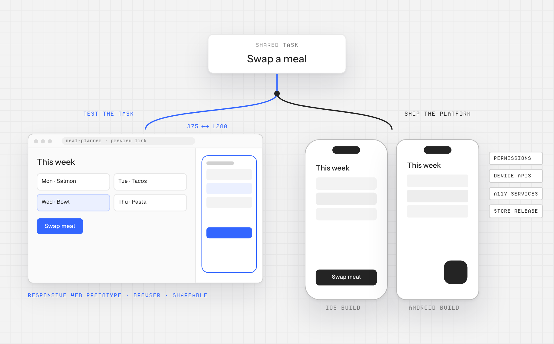
| Question | Responsive web prototype | Native mobile app |
|---|---|---|
| Best early use | Explore layout, content, task flow, and stakeholder feedback through a browser link. | Validate platform behaviors, device integrations, and release requirements. |
| Delivery | Browser-based web code and a shareable page. | Platform-specific application build and store or managed distribution. |
| What to check | Viewport reflow, touch, browser accessibility, navigation, and real content. | Operating-system conventions, permissions, device APIs, accessibility services, and device testing. |
Anima Playground supports the left-hand workflow: generate and iterate a working web app from a prompt, URL, or Figma design, then share or export web code according to its getting-started documentation. A native app release requires additional engineering and platform validation. Do not promise a direct native build or store submission from a responsive prototype.
Frequently asked questions
What is the first step in mobile app design?
Define the user, context, core task, and completion signal. Then map the smallest viable flow. Visual style matters, but it cannot rescue the wrong task structure.
Should iOS and Android apps use the same design?
Share the brand, content model, and core task logic, but review navigation, controls, permissions, and accessibility against each platform’s conventions. Identical screens are not the same thing as a coherent cross-platform experience.
Can I use Anima to build a native mobile app?
Anima Playground can create a responsive, interactive web prototype and editable web code from prompts or Figma designs. That is valuable for mobile app design and user testing, but it is not a claim that Playground compiles native iOS or Android binaries.
Good mobile app design is the discipline of choosing what matters most, then testing whether the flow still works outside a perfect mockup. Create a responsive mobile-flow prototype in Anima Playground and use what you learn to guide the final platform implementation.