Generate responsive React code from any Figma design2 min read
Reading Time: 2 minutesWhy Responsive Design Matters
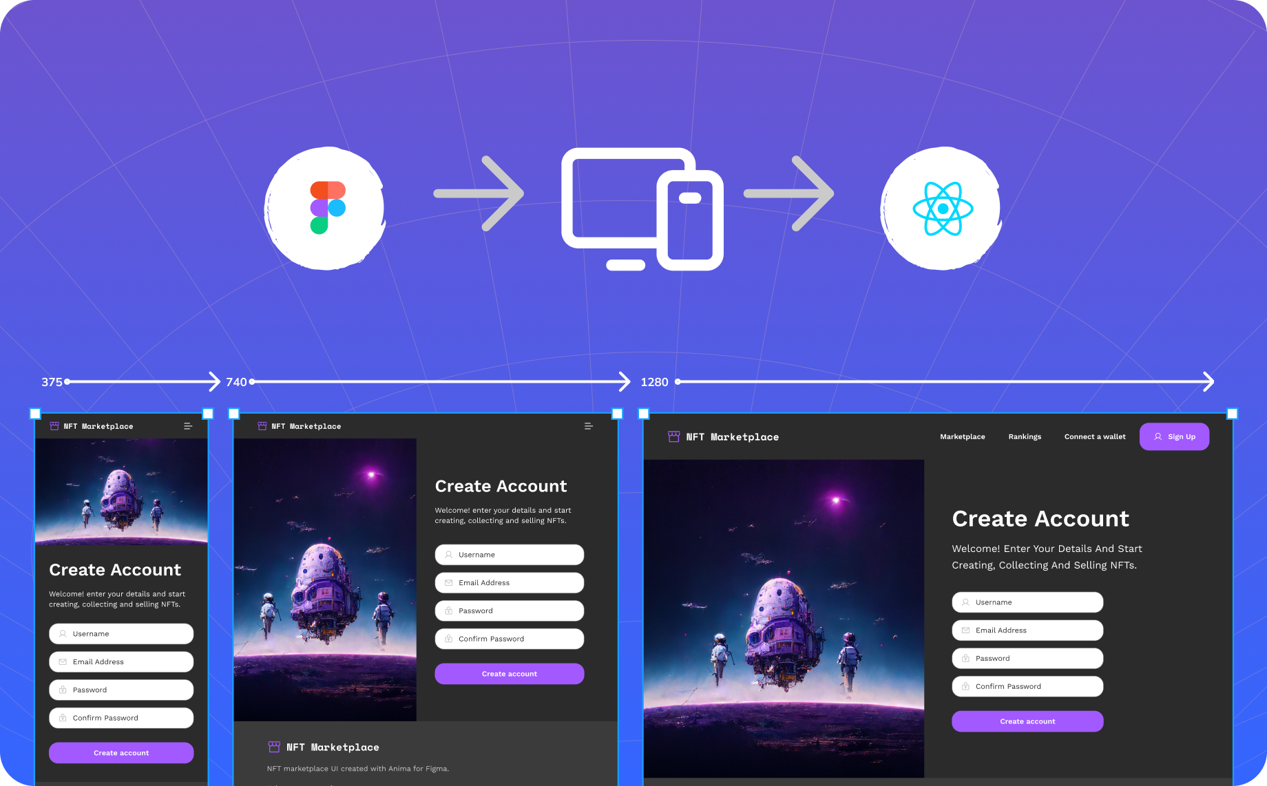
Responsive design ensures your application looks and functions seamlessly across all devices, from desktops to tablets and mobile. Achieving this requires handling layout behaviors, media queries, and flexible components. Anima simplifies this by interpreting Figma designs into React code that adapts automatically to different screen sizes.
Core Workflow: Auto Layout, Breakpoints, and UI Libraries
1. Auto layout into CSS flexbox ↔
Auto layout is a Figma property you can add to your frames and components to create dynamic frames that define how the screen should resize.
Anima leverages Figma’s auto layout to generate React components that adapt dynamically to screen resizing. This ensures that layouts remain consistent and usable across varying dimensions within the same breakpoint.
Missing auto layout? Try Figma’s “Add Auto-Layout” feature to automatically add Auto Layout to your design—it works surprisingly well and saves time 🙂
2. Breakpoints and media queries for adapting viewports 🖥️ 📱
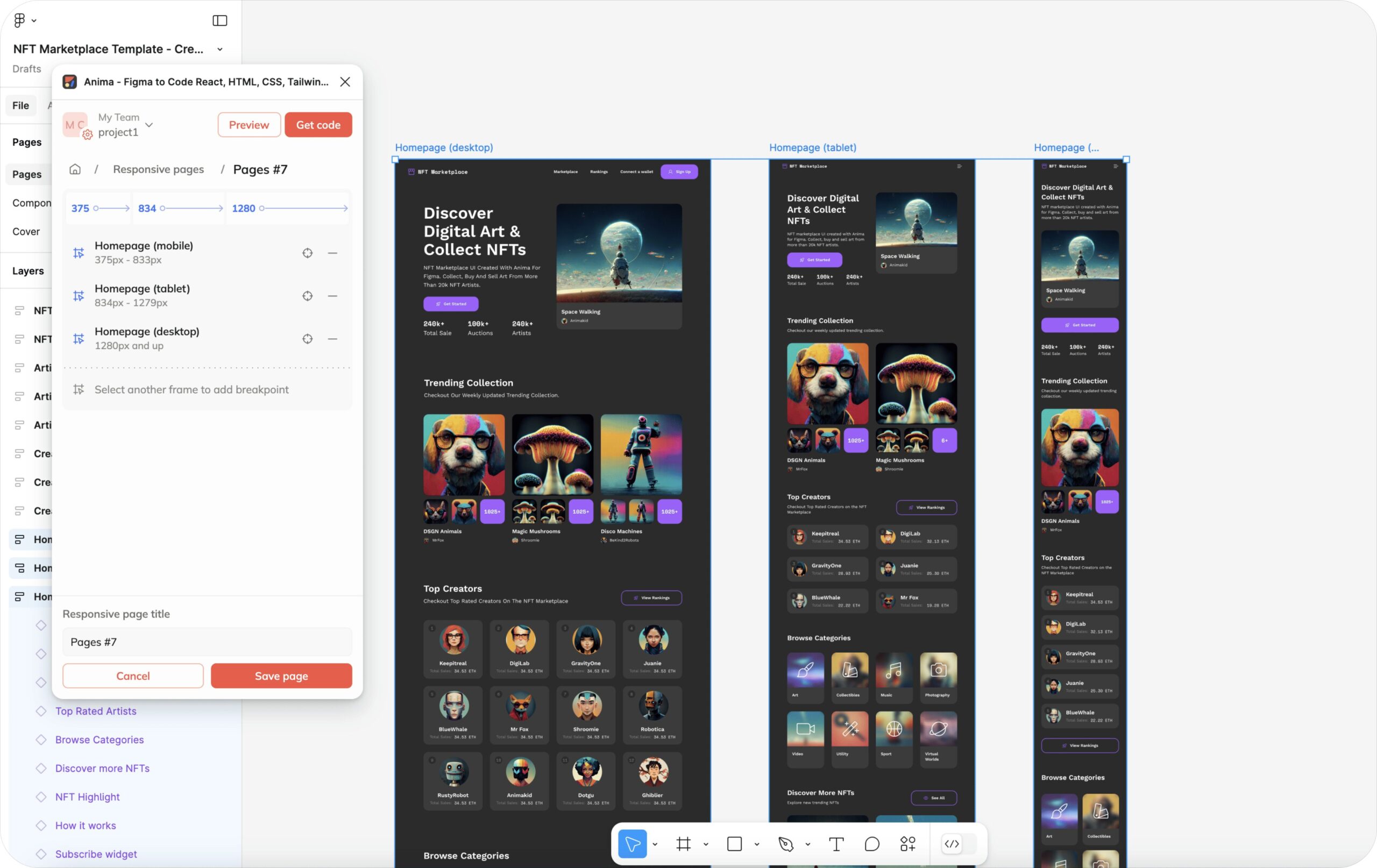
With automated media queries, Anima enables seamless transitions between layouts for different screen sizes. It connects multiple Figma frames, allowing you to define a specific desktop, tablet, and mobile view. With breakpoints, your design dynamically adjusts to look its best on any device.
3. UI libraries for developers: Pre-built responsive components 📗
With dev mode, Anima supports UI libraries like MUI, Ant Design, Radix, and Shadcn, offering pre-built responsive components with predefined behaviors. These components will save you time by reducing the need to build from scratch and improve maintainability through well-structured code.
Balancing fidelity and code quality
Anima offers a high degree of design fidelity, ensuring that typography, colors, spacing, and layouts from your Figma file translate accurately into React code. However, when priorities shift towards code maintainability, Anima’s codegen can favor clean and functional code over pixel-perfect precision.
Choose from:
-
Design mode/Full-flows tab: Prioritizes high design fidelity, allowing designers to create pixel-perfect prototypes and visuals that match their creative intent.
-
Dev mode or Design mode/ Inspect-code tab: Optimizes for code quality, providing clean, functional code that integrates seamlessly into your projects. Features like UI library integrations (e.g., MUI, Ant Design, Radix, Shadcn) are exclusive to this flow.
Ready to experience Anima? Get started here
Join our new 🙌

 Figma
Figma Adobe XD
 Blog
Blog