The future of design-dev alignment and methodology6 min read
Reading Time: 5 minutesThe two worlds of product design and development have been moving toward each other rapidly for over a decade. And although the concepts have become increasingly similar, we still have two sources of truth — Design and Code.
Anima is here to automate design-to-code with AI, freeing developers and designers to create and build digital products faster.
Background: Why is UX so important?
Let’s start with the motivation for improving this process of taking user experience to production.
We live in a digital world. Every day, my phone tells me I spent 3–4 hours on the tiny screen. And thank God my laptop doesn’t tell me how much time I spent there because it’s probably 8–12 hours. We work, communicate, and eventually live a significant portion of our lives on the screen.
We experience everything on the screen through the UX of all the software we use — Google, Slack, Zoom, Gmail, Google Docs, IDEs, Figma, any way of non-face-to-face communication today, financials from banking to trading, shopping, ordering food, reading books, reading the news, watching videos, listening to music, trip planning, taking notes. It’s all digital.
For almost any business today, their website and mobile apps are the new storefront. You want to serve your clients, provide value easily, and engage with them in the best possible way.UX is at the core of every business today, and it is how we experience the world. It is crucial.
Past & present: State of Design-Dev alignment
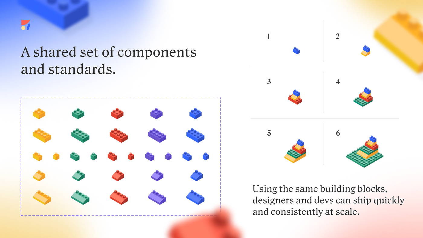
Over the past decade, designers and developers have made huge progress, introducing new tools and methodologies from handoff tools to the concepts of modular components and all the way to design systems.

- Design handoff — 10 years ago, designers manually created red lines and ‘slices’ and sent them over email or Dropbox. We are now living on the same tools — it started with Zeplin/InVision and now Figma.
- Modular components — This concept was brought from code and adopted with love by design tools, starting with Sketch, and quickly became a standard. It allows us both to design smarter with a more modular design with reusable elements and speaks the same language and concepts between design and code.
- Atomic design — Once we adopted components, Atomic design allowed us to start thinking about hierarchy and expanding design systems into a smarter foundation for design work.
- Design tokens — This is another level of shared communication around repeating values between design & code, from fonts to colors, to corner radius, spacing, etc.
“Design tokens are the building blocks of all UI elements. The same tokens are used in designs, tools, and code.”
– Google’s material design
- Component properties — Components have become even more modular and robust with variables and overrides, allowing even more reuse, and again — similar concepts from development brought into the design process.
- Component variants — Yet another level of modularity, allowing our components to change their layout, content, and hierarchy to support different states (disabled, hover, error, expanded, mobile vs. desktop).
- Responsiveness — Auto-layout, Auto-responsiveness, Pins, Constraints, and other ways to make our design dynamic have made their way to design tools as the standard way to design.
Conclusions from 1000 talks: There is no silver bullet
Talking with a thousand Design system teams over the past year, we learned that the design-development alignment is not a solved problem yet. There is no silver bullet on how to do it perfectly. We are still evolving.

Here’s what we’ve learned from 1,000 talks with design systems teams:
- Figma is not fully updated. And code. And Storybook — Having two sources of truth makes it hard to keep up-to-date design with everything in code/production. A lot of maintenance is required, and most teams can’t afford it. 25% Started to adopt Storybook, and less than 40% managed to keep it updated.
- Everyone redesigns — 30% are redesigning now, 30% plan to redesign soon, and you cannot redesign if the design files do not reflect your live product.
- Multi-layer DS is a thing — Simply put, large companies need a core design system for multiple products/brands and expand it for every product/brand. Making the design system multi-layer.
- Open-source as a base — This is a great best practice. Save time on creating the components that every product has — Why reinvent inputs, buttons, and date pickers? Just define your needs first and align on the open source technology with both design and teams. The most popular choices are MUI and Ant, but many alternatives exist.
- UX Agencies — This is a fascinating case. UX agencies create and manage or hand off design systems regularly. They live and breathe design systems to the extreme and are specialized in setting them up. Here, the best practice of starting with an open-source or a proprietary base DS is widespread.
The future: The next phase is automation
AI is not here to steal our jobs. I believe it will allow us to design faster, build faster, communicate better, and be on the same page.I see the next phase of evolution in automation. Anima plays a crucial part in this phase of evolution. Anima has over 600k installs on Figma and over 300k on Adobe XD. We have recently partnered with Figma to co-launch #DevMode, where Anima turns design into code right inside Figma.
Near-term predictions
Anima is not alone. We will see more automation around design-ops and development alignment:
- Co-pilot design tools — Tools like Diagram will rise and help designers draft new flows based on your Design systems.
- Design Systems governance and adoption are classic tasks for AI.
- UX copy automation tools will assist in writing, micro-copy feedback, and applying voice and tone across your product.
- Tokens automation — Tokens are a great shared language between design and code. Tokens Studio already syncs design and code.
- Storybook automation — Storybook is excellent for DS alignment and adoption but is hard to maintain. AI will maintain it for you.
- Responsiveness and dynamic layouts (i.e., Auto layout) are incredible but take time. It will be automated, created, and maintained for you.
A lot is coming now that screen-first design tools have matured, with new technologies now available thanks to Genetarive AI.
Where to Go From Here
First, I invite you to follow me & Anima on Twitter/LinkedIn. We’ll be announcing our upcoming releases, all of which are centered around AI-powered, automated design-to-code. A few months ago, we released Frontier, the first AI coding assistant, tailored for frontend development.


 Figma
Figma Adobe XD


