Build MVPs faster with ready-to-use components in Figma4 min read
Reading Time: 3 minutesIn the current competitive landscape, who has time or money for a traditional product development process?
Whether you’re launching an MVP to validate your product early or building a live demo for an upcoming sales call, you’ve gotta run fast.
The problem is, MVPs and demos—even the most basic ones—can take too long and cost too much to design and develop from scratch. But there’s a solution.
If you need to get your product live quickly to test your assumptions or close a deal, your best option is to start with pre-built, customizable components.
Move faster with ready-to-use components
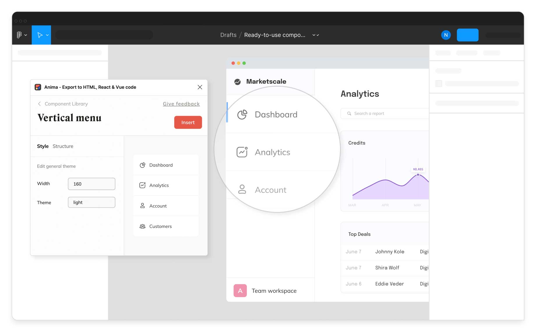
With Anima’s new Component Library for Figma, we’re changing the way teams build software. We’ve selected the best open source components from the top libraries, each one fully implemented in production-ready React code. You can use these customizable building blocks to go live fast without investing precious early-stage resources in design and development.
- Founders and designers can quickly build MVPs in Figma with the same open-source components developers use in production.
- Developers can skip the grunt work of searching open source libraries for components that are “close enough,” then editing props to match the design.
- Teams can deliver better apps and websites with a fraction of the time and resources.
👉 Install our Plugin here to start building your product in Figma! 👈
Design in Figma with live, customizable open source React components
From MVP to Full-Scale Product
Although MVPs are a great way to validate your assumptions early with minimal risk, MVPs built from scratch are generally barebones, inconsistent, and difficult to scale. In most cases, they’re thrown away when it’s time to build the actual product.
With Anima’s Component Library, however, you’re building a foundation for your full-blown product with a reusable, scalable set of building blocks.
Why open source UI Libraries?
There’s a huge variety of open source component libraries. They’re well-maintained and have already been developed and tested. So why torture yourself trying to invent new components that would take days to build and probably lack some capabilities?
With that in mind, we populated our Component Library with React components from three of the leading libraries: MUI, Bootstrap, and Ant Design.
What are the benefits?
Save time
- Our components are fully customizable. You can easily adjust them to meet your needs, then insert them into your design in a click.
- We integrated the top open source UI Libraries devs already use, so there’s no need to code from scratch or search for matching components.
- Export production-ready code for each component, so you can go live fast.
Save money
- Explore and use → Research is expensive and time-consuming, which is why we did the research for you. As a result, our Component Library contains the best code components, for the widest range of applications, from the top UI libraries available.
- Ready for production → Don’t spend limited resources designing and developing what already exists in code. Our library contains all the building blocks you need to launch your product, and is backed by clean, deployable React.js.

All components are fully implemented in React and refer to specific open source libraries
Who is this for?
Founders
Go live quickly using customizable components you can easily match to your brand or application (we use MUI, Bootstrap, and Ant Design’s APIs to enable full customization).
✅ Be ready for demos and sales calls
✅ Reusable, scalable components = MVPs you can build on
Designers
Modify components to meet your needs with the ability to change things like states and color schemes. You have full creative control, so you can easily match the MVP to your brand’s aesthetic—then export production-ready code.
✅ Designs can be implemented quickly and accurately
✅ See exactly what your users will see
✅ No need to plan each state for every component
Developers
No more digging through different React libraries to find the components you need. We’ve already selected the best open source components from the top libraries, each fully implemented in production-ready React code.
✅ Get designs that are easy to implement
✅ Each component refers to an open source library
✅ No need to search for components and edit props
What can you build with Anima’s Component Library for Figma?
Check out the examples below, or visit Anima’s Showcase Page to see what you can create with all of Anima’s features.
E-Commerce app with Figma + Anima, Shopify, and Netlify
Banking app with Figma + Anima, Strapi.io, and Netlify


 Figma
Figma Adobe XD
 Blog
Blog


